ADF for beginners part 1
ADF faces in detailed:
for more details:
https://download.oracle.com/otn_hosted_doc/jdeveloper/11gdemos/Insider_ADF12c_Overview/Insider_ADF12c_Overview.html
Developing User Interfaces with ADF Faces Rich Client Components
In this tutorial, you learn how to create JSF pages using Oracle ADF Faces Rich Client Components. Oracle ADF Faces Rich Client is a set of standard JSF components that include built-in interactive functionality provided by Ajax and other UI technologies. While Ajax allows rich client-like applications to run on standard internet technologies, JSF provides server-side control, which reduces the dependency on an abundance of JavaScript often found in typical Ajax applications.
 Read more...
Read more...| Purpose | Duration | Application |
|---|---|---|
This tutorial shows you how to develop a page based on a page template. Then you design the layout, add data components and change the look and feel of the page. Click the Download button to download a zip of the starter application that you will use in this tutorial.
The file contains two zip files (ADF_Faces_Tutorial_Starter.zip and ADF_Faces_Tutorial_Solution.zip), one with the starter application, the other the completed solution.
| 2 to 2.5 hours |  |
In this section you open the starter application and create a page template to be used for additional pages you will create: To create the page template perform the following steps:
Page templates let you define entire page layouts, including values for certain attributes of the page. Read more...
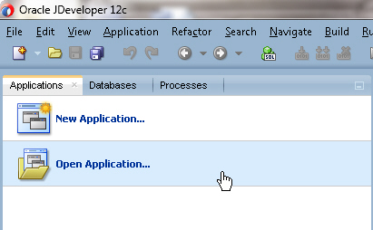
Read more...- In the Applications window, click Open Application .
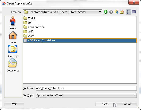
- In the Open Application(s) dialog, locate the folder where you unzipped the application and select ADF_Faces_Tutorial.jws. Click Open.
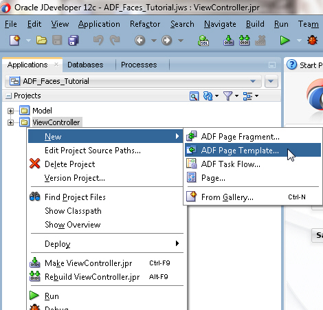
- In the Applications window, right-click the View Controller project and select New > ADF Page Template from the context menu.
- In the Create ADF Page Template dialog, type storetemplate.jsf for the template file name. Click Next.
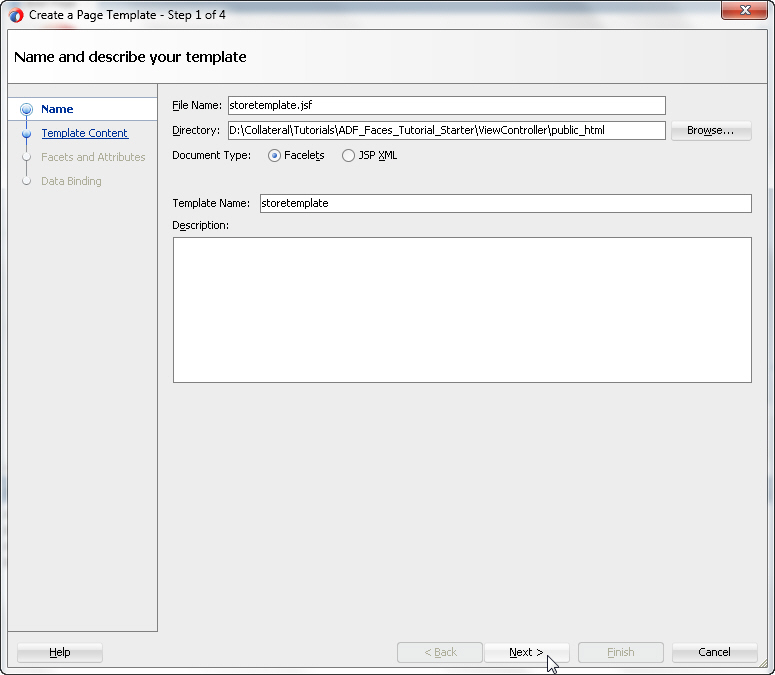
Click Next again to create the template from a blank template. - In the Facet Definitions page, click the Add
 button and type center as the facet Name.
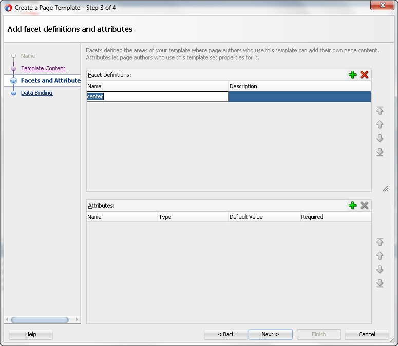
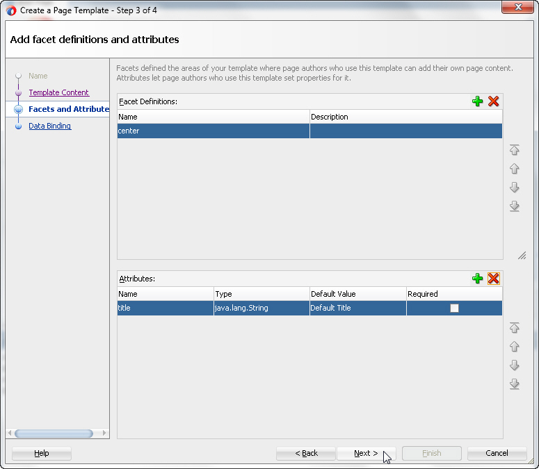
- In the Attributes section, click the Add button, then type title as the Name and Default Title as the Default Value.
Click Next and then Finish to complete the template creation.The storetemplate.jsf template page opens in the design editor.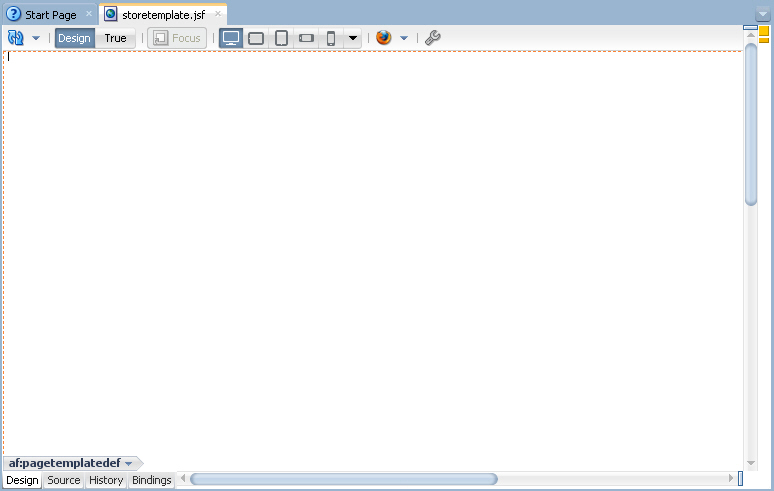
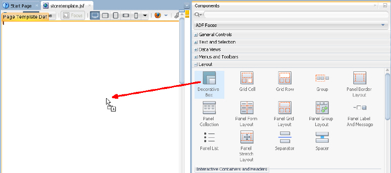
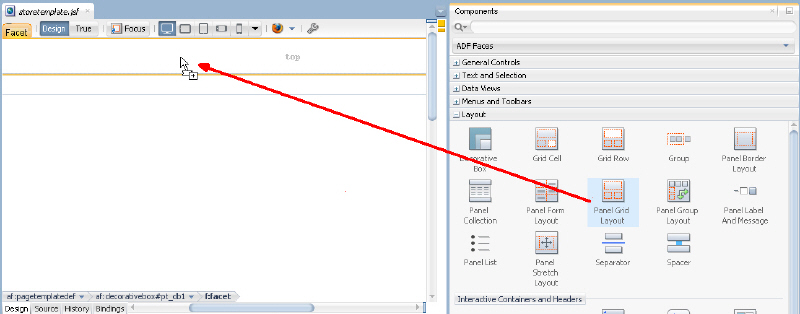
- From the ADF Faces Components window, expand the Layout node and drag a Decorative Box onto the empty page in the Design view.
 Using the Properties window, in the Style and Theme category, set the Theme property to light.
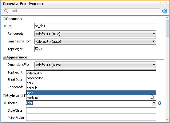
- A decorative box provides two facets, represented by dashed lines and the words 'top' and 'center' within the design view. From the Layout category of the Components window, drag and drop a Panel Grid Layout into the top facet.
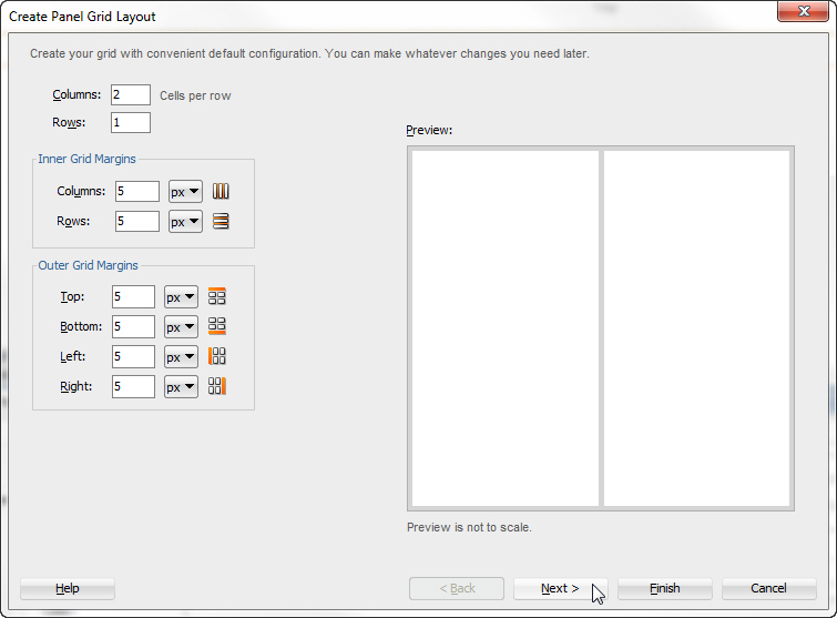
- In the Panel Grid Layout dialog box, set the columns to 2 and the rows to 1 and click Next.
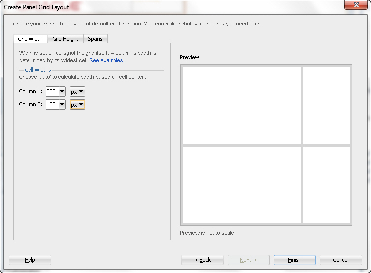
- Set the grid width for column 1 to 250 pixels (px) and the width for column 2 to 100 pixels (px) and click Finish.
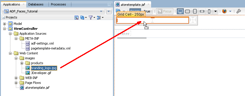
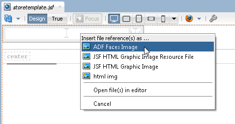
- In the Applications window, expand the Web Content and images nodes. Drag branding_logo.jpg onto the first cell of the panel grid layout.
- From the Text and Selection section of the Components window, drop an Output Text component onto the second grid cell of the panel grid layout.
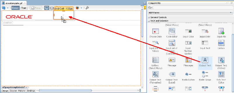
- This is a case where it can be difficult to tell exactly where in a layout a component is placed. To verify placement of the output text component, expand the Structure window and locate the af:outputText component.
If necessary, drag and drop within the Structure window to ensure the af:outputText component is placed within the second af:gridCell component.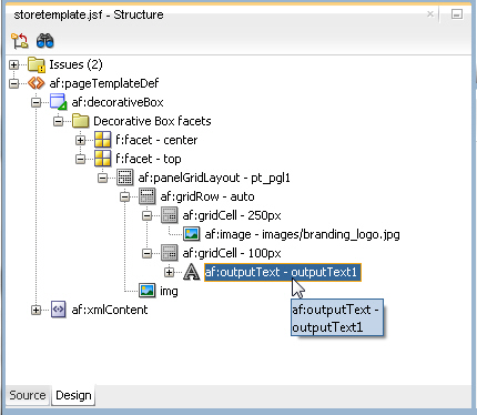
- Select the outputText component in the visual editor or in the Structure window. In the Properties window, locate the Value property. Click the Property Menu icon and choose Expression Builder...
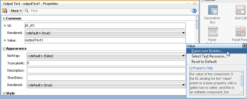
- In the Expression Builder dialog, expand Scoped Variables and attrs and select title to set the expression to #{attrs.title}.
Then click OK.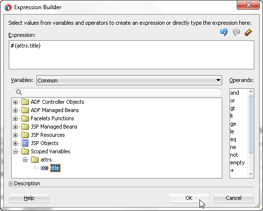
- In the Components window, expand the Layout node and scroll down to the Core Structure section. Drag and drop a Facet Definition onto the center facet.
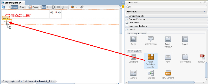 In the Insert Facet Definition dialog, select center as the facet name, then click OK.
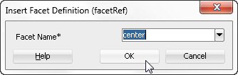
- Click the Save All
 icon in the JDeveloper menu bar, or select File - Save All from the menu to save the page.
The application is loaded in the Applications window.
In the menu select ADF Faces Image.
Now that the template has been created you can create a new page and use the template as the default structure for the page. To do this, perform the following steps:
You can use page templates to build JSF pages or page fragments. Read more...
Read more...- Right-click the ViewController project and select New > Page...
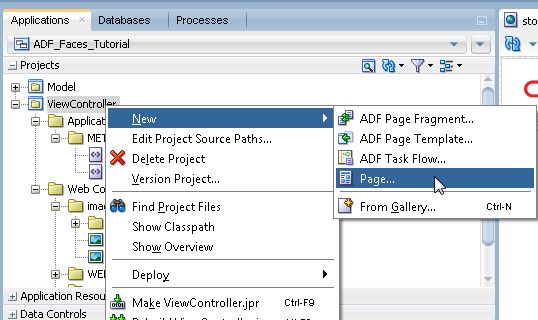
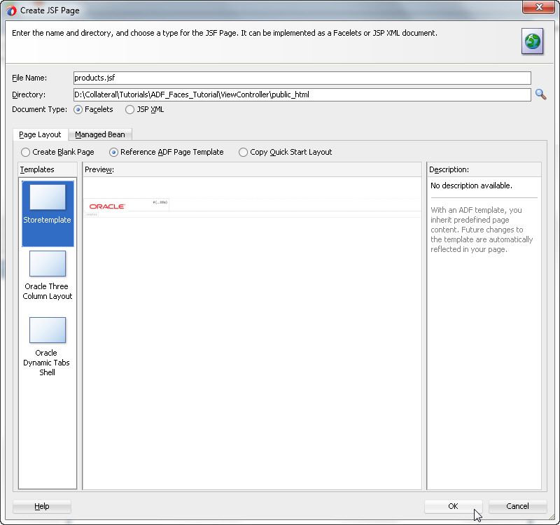
- In the Create JSF Page dialog, change the file name to products.jsf and ensure the Document Type is set to Facelets. Select the Reference ADF Page Template radio button and choose the Storetemplate template. Click OK.
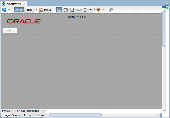
- The products.jsf appears as a new node in the Applications window and opens in the Design editor using the storetemplate.jsf template.
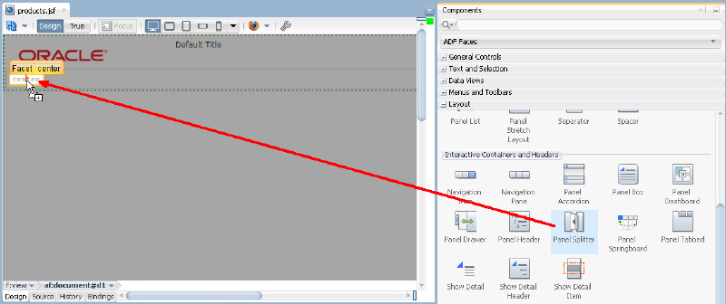
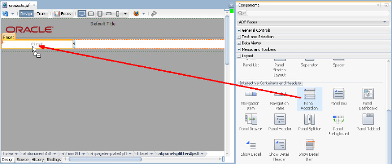
- From the Components window, expand the Layout category, and drag and drop a Panel Splitter component onto the center facet.
 In addition to the Panel Splitter, ADF Faces provides a number of other layout components that can be used to arrange other components on a page.Read more...
 - Drag and drop a Panel Accordion layout component onto the first facet on the left hand side of the panel splitter.
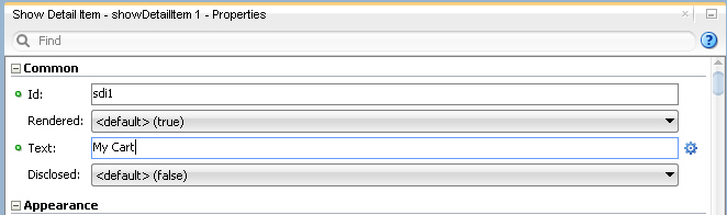
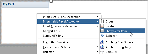
- Select the showDetailItem in the structure or design view and in the Common area of the Properties window, set the Text of the showDetailItem to My Cart.
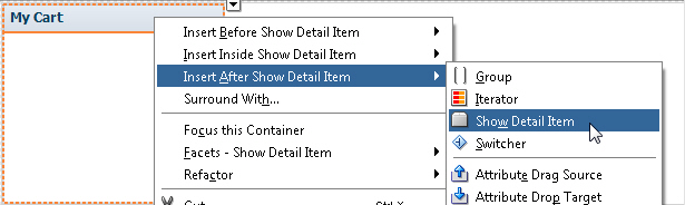
- Now add another pane to the accordion. To do so, you can either right click the My Cart showDetailItem in the structure or design view and choose Insert After Show Detail Item > Show Detail Item, or you can right click the panelAccordion in the structure or design view and choose Insert Inside Panel Accordion > Show Detail Item.
- In the Properties window, change the Text property to Recommendations.
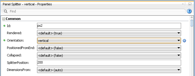
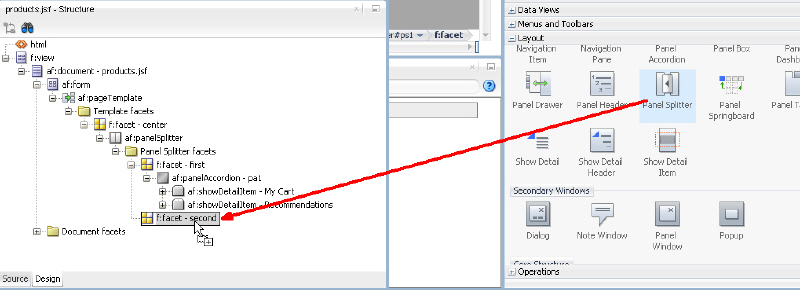
- Drag and drop another Panel Splitter component onto the second facet of the panel splitter. You may want to use the Structure window for this action.
- Using the Properties window, set the Orientation of this nested panel splitter to vertical.
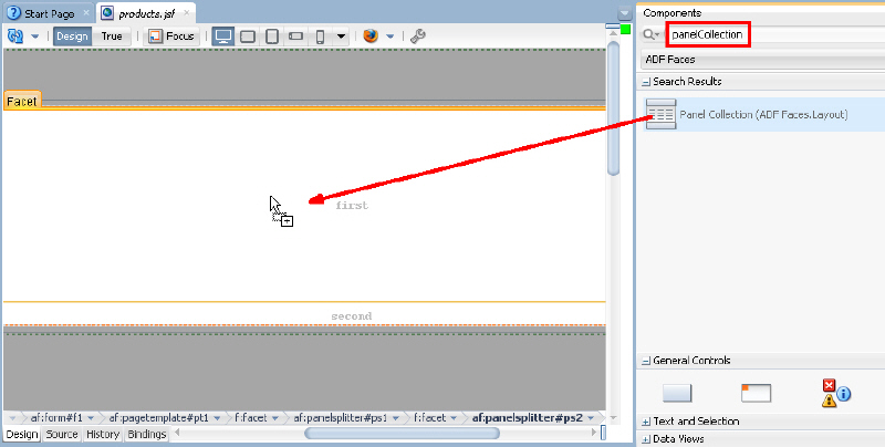
- Drag and drop a Panel Collection component onto the first facet of the nested vertical panel splitter. If you have trouble locating a component in the ADF Faces Components window, you can search for it using the search box at the top of the window.
- Drag and drop a Panel Tabbed component onto the second facet of the panel splitter. The component can be found in the Interactive Containers and Headers grouping of the Layout category.
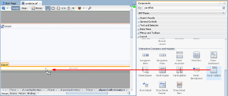
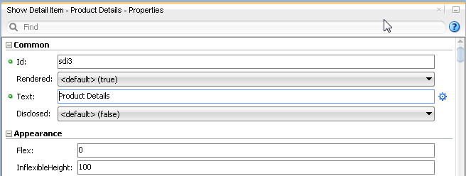
- In the Structure window, select the af:showDetailItem component that was automatically added to the panel tabbed component and in the Properties window, enter Product Details in the Text property.
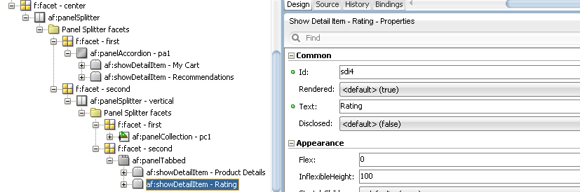
- Right click the Product Details tab in the visual editor and select Insert After Show Detail Item > Show Detail Item from the context menu.With the new af:showDetailItem component selected, enter Rating in the Text property in the Properties window.
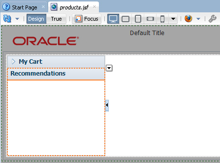
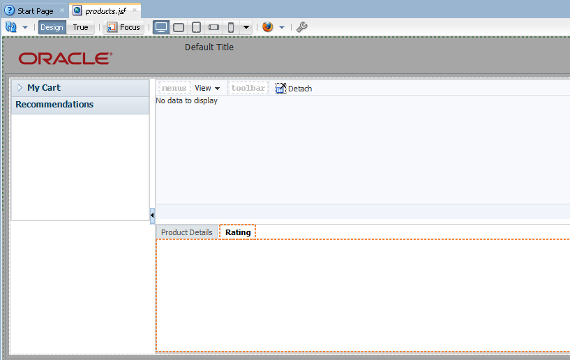
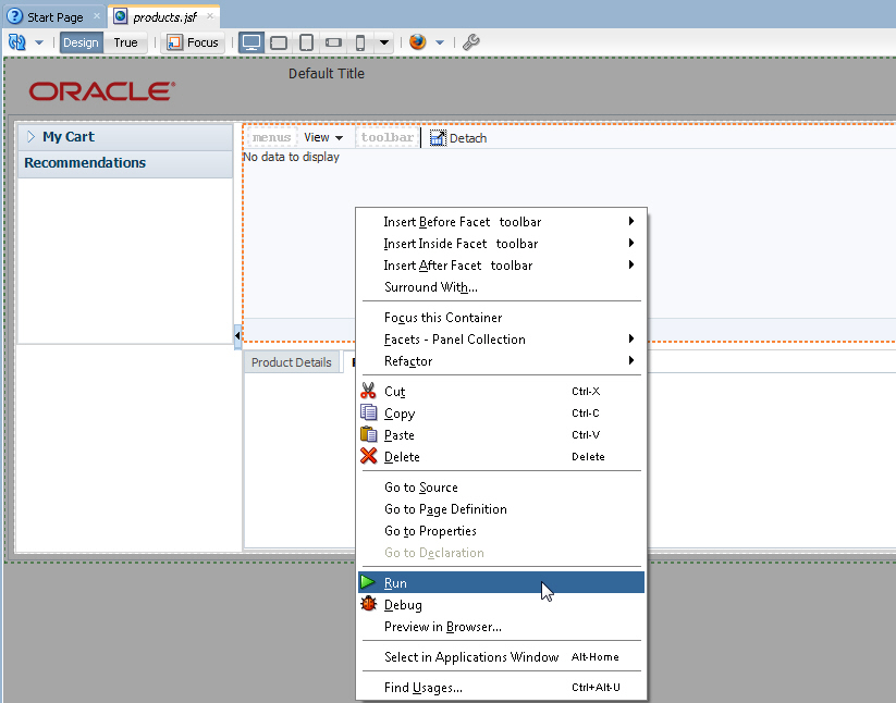
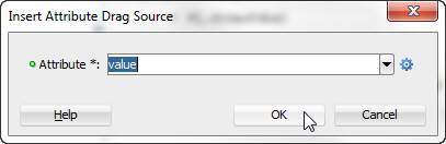
- Double click the products.jsf tab to maximize the design view. The page should look like the following image:
- Save all your work. Then right-click anywhere in the design view of the page and from the context menu, select Run. You can double click the products.jsf tab again to toggle the maximized view.
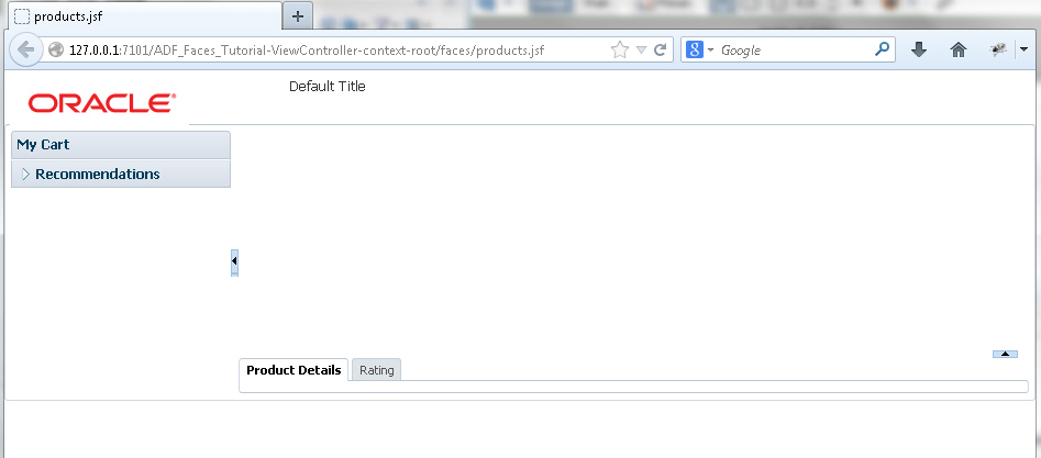
- The page will load in your browser after it is deployed to the integrated WebLogic Server. (Integrated WebLogic Server will be installed and configured if this is the first time you are running an application from JDeveloper). Experiment with selecting the tabs and expanding the Recommendations panel. Once you're finished, keep the browser open and return to JDeveloper.
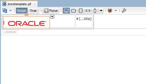
- In the next steps, you customize the page title and see how it is consumed in the existing page. To start the process, open the storetemplate.jsf template page in the design editor..
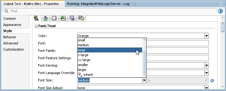
- In the design view or structure window, select the outputText component that contains the title. In the Properties window, in the Style node, set the Font Color property to a color of your choice (Orange in our example).
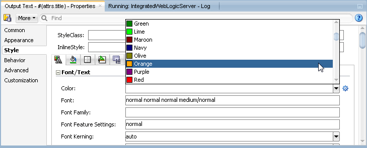
- In the Font Size property, select large from the drop-down list.
- Save all your work. Then go back to the browser and reload the page to see the new characteristics.
Note that after saving your JDeveloper application, refreshing your browser window reflects the new changes made to your application as long as you haven't updated any binding components. In that case you will need to re-run the page from JDeveloper in order to have the changes reflected in your browser.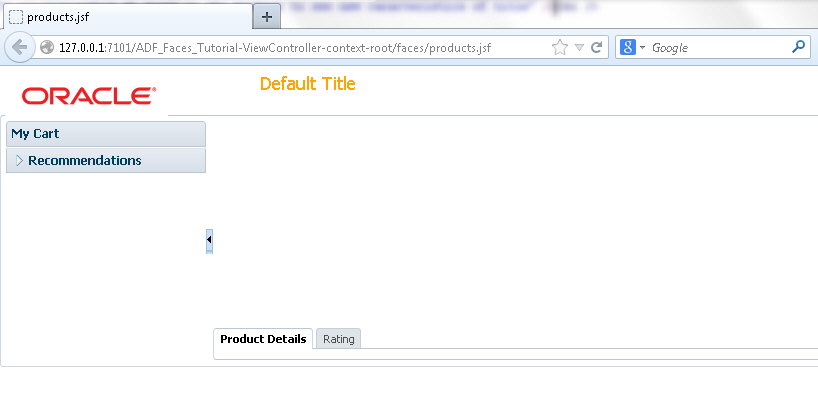
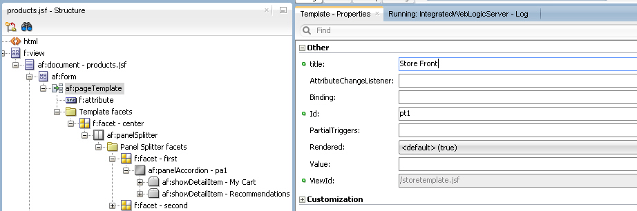
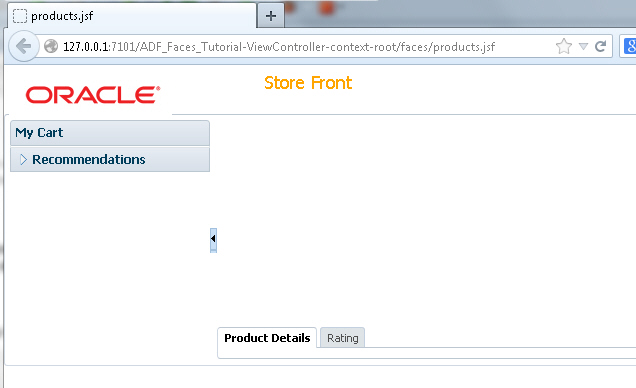
- Open the products.jsf page in the design editor. In the Structure window, select the af:pageTemplate tag and in the Properties window, set the Title property to Store Front.
- Save all your work. Then reload the page in your browser to see the new characteristics.
If the page doesn't render visually in the design editor and instead looks like a series of nested boxes, close the workspace and reopen it.
A Panel Accordion component is added to the facet, and a nested Show Detail Item is also created, to hold content for the first pane of the accordion.
The page layout is complete, now it's time to add some data. The first step in this process it to create data controls from the Products POJO (Plain Old Java Object). To do this, perform the following steps:
Once you have your application's services in place, you can use JDeveloper to create data controls that provide the information needed to declaratively bind UI components to those services. Read more...
Read more...- From an existing POJO Class, create the data control using the ADF Data Binding facility.
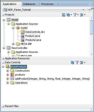
In the Applications window, expand the Model project. Expand the Application Sources and model nodes. Right-click Products.java and select Create Data Control from the context menu.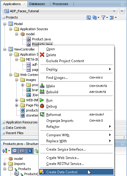
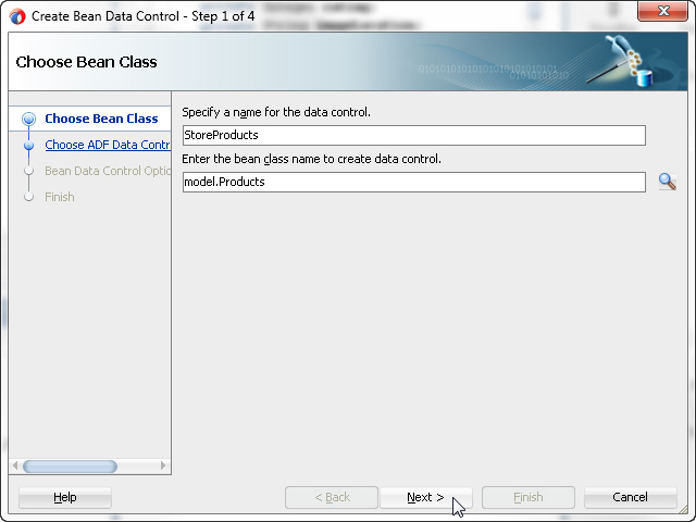
- In the first page of the Bean Data Control dialog, change the name of the data control to StoreProducts and click Next.
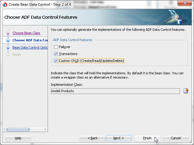
- In the Choose ADF Data Control Features page, select the Transactions and Custom CRUD features and click Finish.
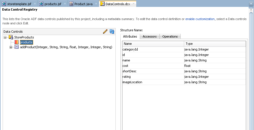
- The DataControls.dcx file is created and will open in the editor. You could define UI hints and validation at this layer, but you will accept the defaults here and continue on creating the user interface.
Click the products.jsf tab to bring it to the foreground of the editor. - In the Applications window, expand the Data Controls accordion and expand the StoreProducts node. You may need to click the refresh icon in the Data Controls panel to enable the StoreProducts node.
- Drag and drop the products collection of the StoreProducts data control onto the center area of the af:panelCollection in the design editor. From the popup menu, select ADF Table...
- In the Create Table dialog, select the Row Selection (Single Row) option and click the Enable Sorting and Read-Only Table options.
Then click OK.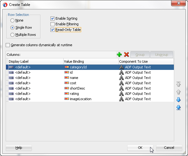
- In the Structure window, select the af:table component and in the Properties window, expand the Behavior node. Set the EdtingMode property to clickToEdit. In the Appearance node, set the ColumnStretching property to last.
Hint: To quickly locate a property by name, type the property name in the search field at the top of the Properties window.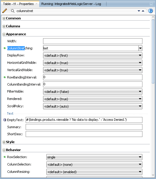
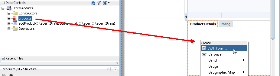
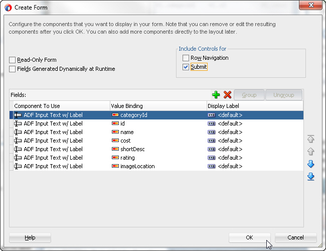
Save your work. - In the design view of the products.jsf page, select the Product Details tab to bring it to focus. Drag and drop the products collection from the StoreProducts data control onto the Product Details tab component. In the popup menu, select ADF Form...
- In the Create Form dialog, select the Submit checkbox to include a control for a submit action.
Click OK. - Now add an ADF List View component. The ListView component uses oracle.adf.view.rich.model.CollectionModel to access the data in the underlying list. You may also use other model instances, e.g., java.util.List, array, and javax.faces.model.DataModel and the listView will automatically convert the instance into a CollectionModel.
Expand the Recommendations accordion pane in the design view. Drag and drop the products node from the data controls window to the recommendations accordion in the design view. In the popup menu, select Table/List View > ADF List View...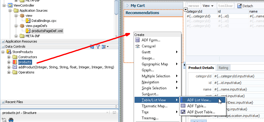
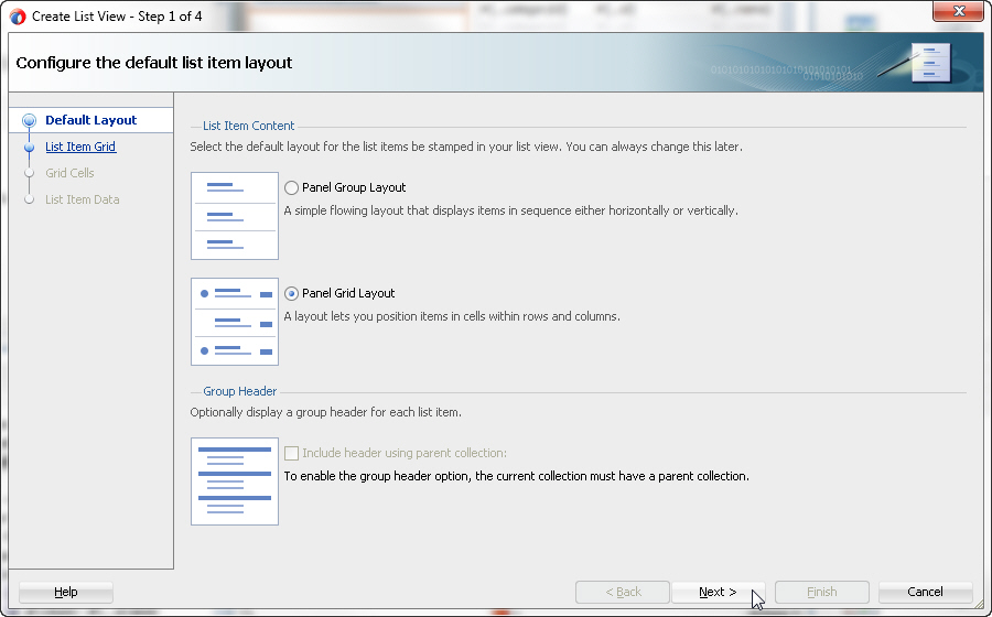
- In the Create List View dialog, select the Panel Grid Layout layout and click Next.
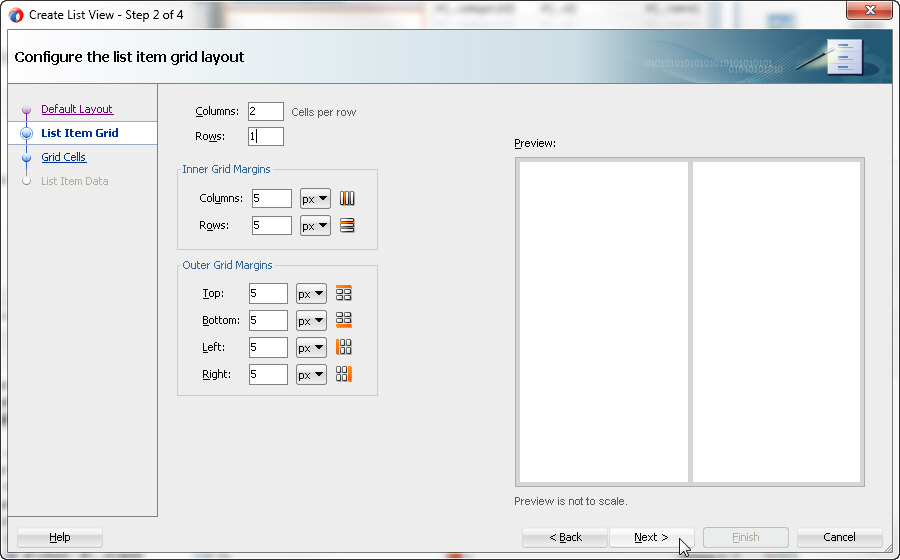
- Set the Columns to 2 cells per row and number of Rows to 1.
Click Next. - Set the Column 1 width to auto and the Column 2 width to 50 px (pixels).
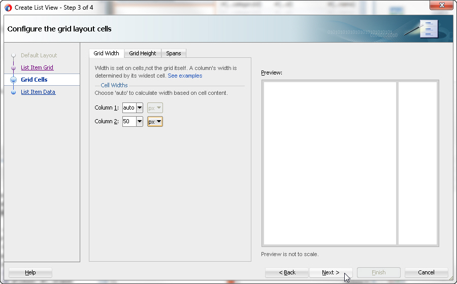
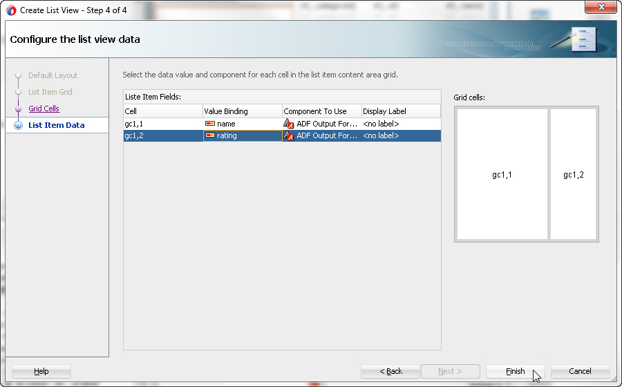
Click Next. - Click the value binding for the first column and select the name item. Set the second column value binding to rating.
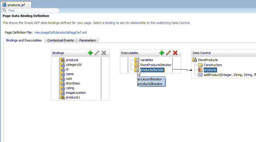
Click Finish. - Data from the products data control is being displayed on this page in three different binding styles. To ensure that all rows are available so that all three bindings are kept in sync, modify the products iterator range size. Select the Bindings tab for the products.jsf page. In the Executables section, select productsIterator.
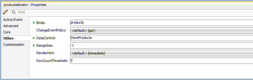
- In the Properties window, set the RangeSize property to -1.
- Save all your work and right-click the page and choose Run to re-deploy and re-run the page.
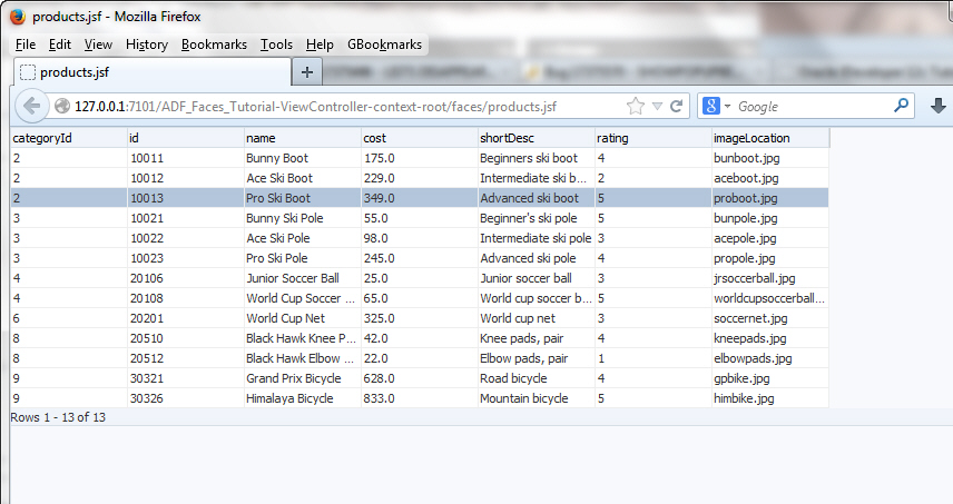
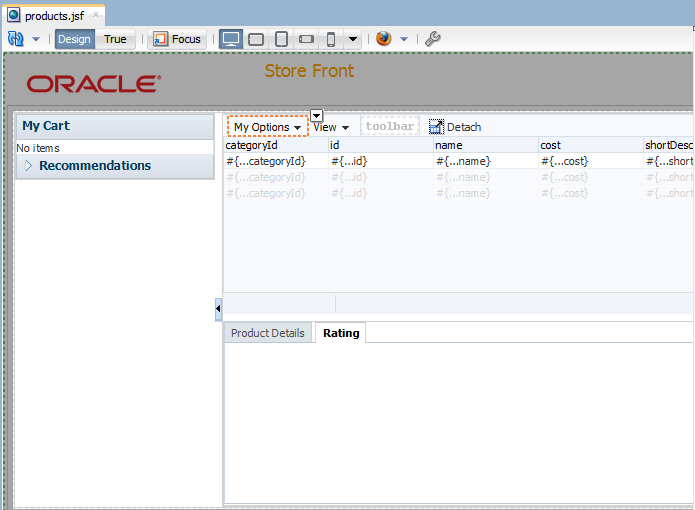
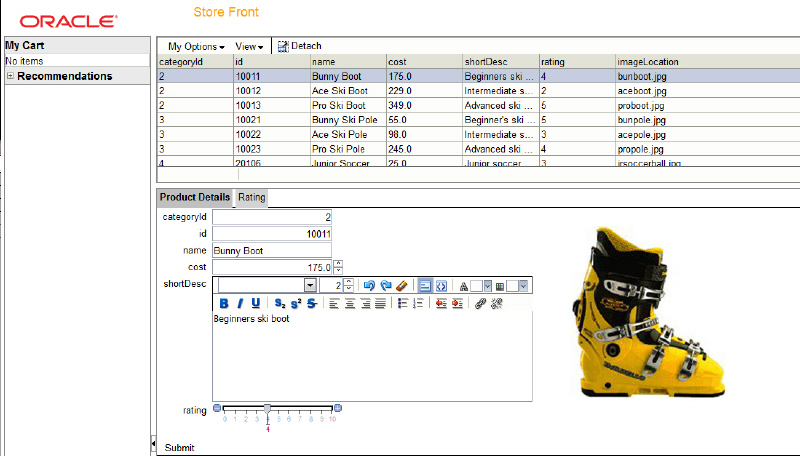
The page should display the product data in the Recommendations accordion, table, and form as shown: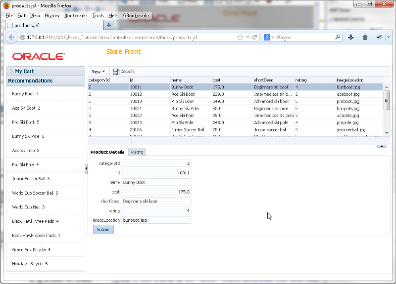
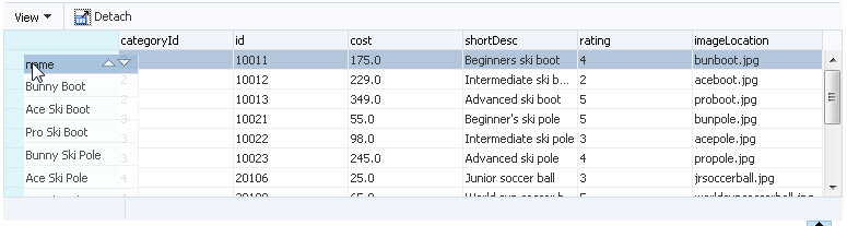
- Select one of the column headers in the table and move it to another location in the table.
- Experiment with column resizing in the table using the shortdesc column. Click the Detach menu option to isolate the content of the panel in the browser.
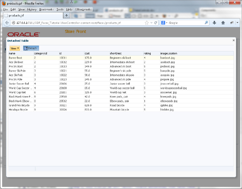
Click the Detach option again to return to the original display. - Explore the View menu option and hide some of the columns.
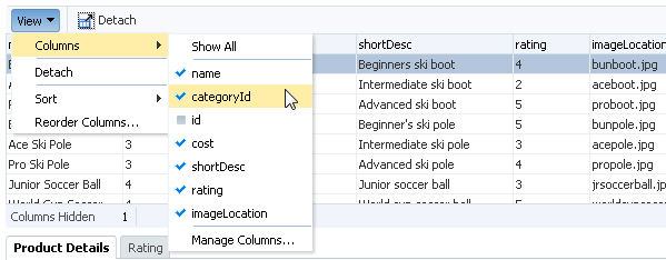
The columns will remain hidden until you redisplay them. The number of hidden columns is displayed in a message below the table. Column reordering and resizing are features of the ADF Faces table component, while the View menu and it's capabilities and the Detach button are part of the Panel Collection component. - In the next few steps you add some images and graphical items to the page.
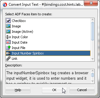
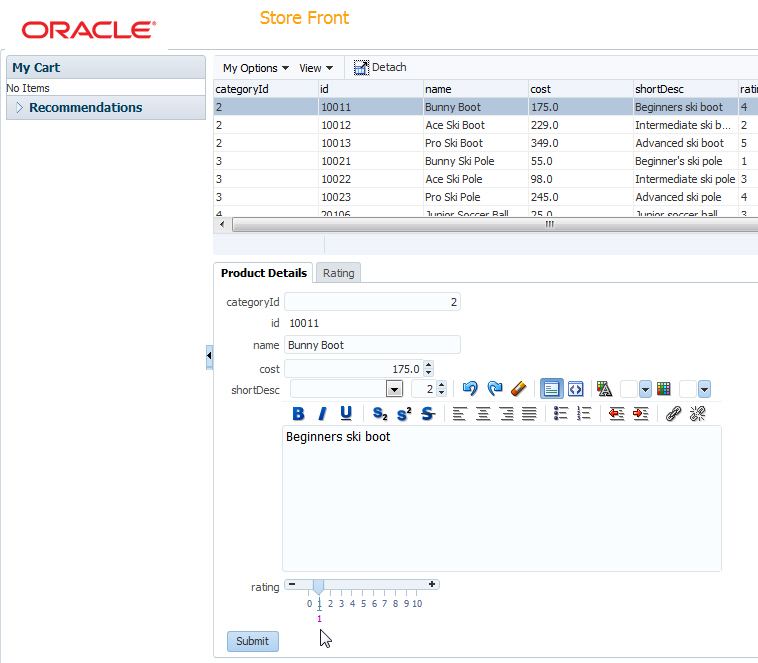
In the Product Details tab, right-click the cost inputText item in the form and select Convert To... from the context menu. - In the Convert Dialog, select Input Number Spinbox and click OK.
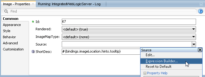
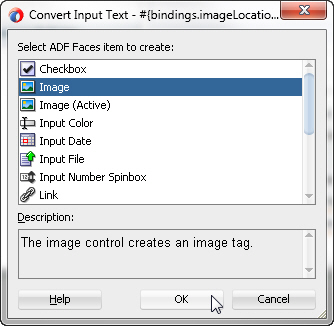
Click OK again in the Confirm Convert box to remove the unnecessary attribute. - Notice that the imageLocation attribute is rendered as an inputText component. To display an image, change the component style. In the Product Details tab, right-click the imageLocation item and select Convert To... from the context menu. In the Convert Dialog, select Image and click OK.
- With the new image component selected, go to the Properties window and next to the source property, click the property menu icon and select Expression Builder... from the drop-down list.
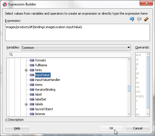
- In the Expression Builder dialog, type images/products/ in the Expression text area. To create the rest of the expression, expand ADF Bindings, bindings, and imageLocation. Select inputValue to generate the expression and click OK.
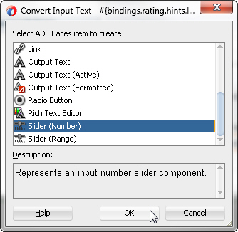
- In the Product Details tab, right-click the rating component and select Convert To... from the context menu. In the Convert Dialog, select Slider (Number) and click OK.
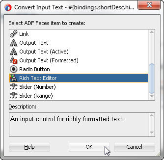
Click OK again in the Confirm Convert box. - In the Product Details tab, right-click the shortDesc component and select Convert To... from the context menu. In the Convert Dialog, select Rich Text Editor and click OK.
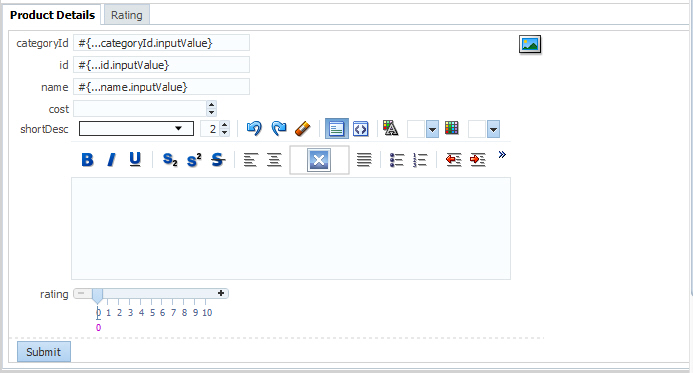
Click OK again in the Confirm Convert box. - In the Structure window, select the panelFormLayout for the Product Details tab. In the Properties window, enter 6 for the Rows property so that the 7th row item (imageLocation) will wrap to the 2nd column of the panelFormLayout. The Products Details tab should now look like this:
- Save all your work. Switch back to the browser and reload the page.
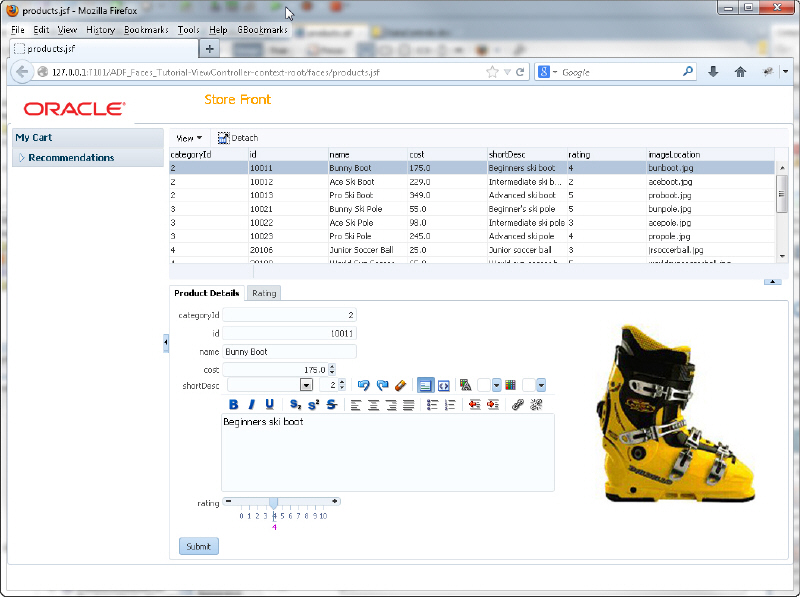
- Experiment moving the rating slider, the cost spinbox, and using the rich text editor. Notice that selecting any of the rows in the product table automatically changes the row currency in the Product Details tab. This is handled by the ADF Data Binding layer.
Structured data can be displayed as tables consisting of rows and columns using the ADF Faces table component. Read more...
Read more... 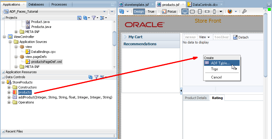
There are a variety of ways to make analyzing data easier for end users by using graphical components. Read more...
Read more...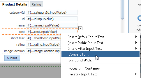
Click OK again in the Confirm Convert box to remove the unnecessary element and attributes.
Behavior components are those that provide operational functionality to an application. In this section you will create menus, popup and printable pages and allow users to drag and drop products into a shopping cart area. To implement this type of functionality, perform the following steps:
The ADF Faces framework provides the ability to drag and drop items from one place to another on a page at runtime. Read more...
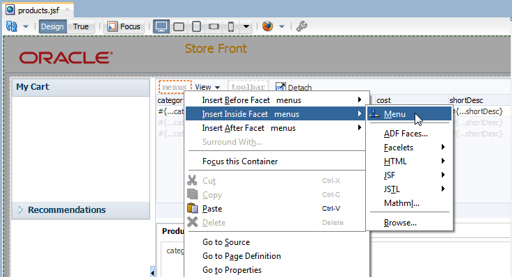
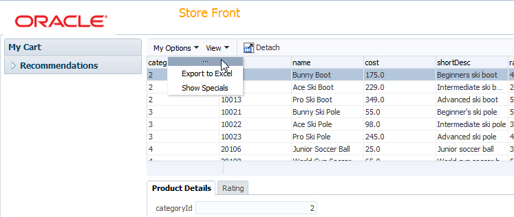
Read more...- To implement menus in your application, add a menu to the panel collection for the table. In the design editor of the products.jsf page, right-click within the menu facet in the panel collection and select Insert inside Facets menus - Menu from the context menu.
- In the Properties window, set the Text property for the menu to My Options.
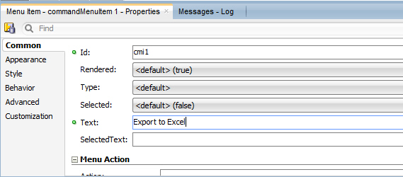
- Right click the My Options Menu and select Insert inside Menu > Menu Item from the context menu.
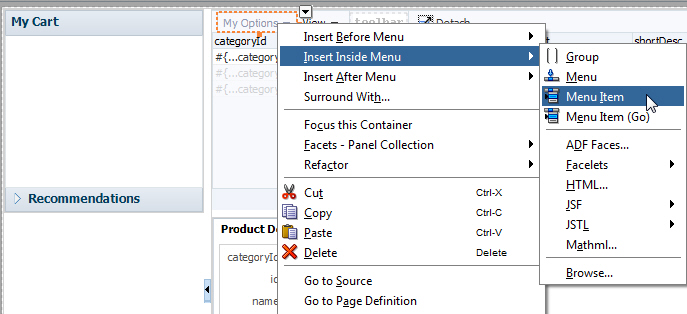
- In the Properties window set the Text property to Export to Excel.
- In the Structure window, right click the af:commandMenuItem component and select Insert after Menu Item > Menu Item from the context menu.
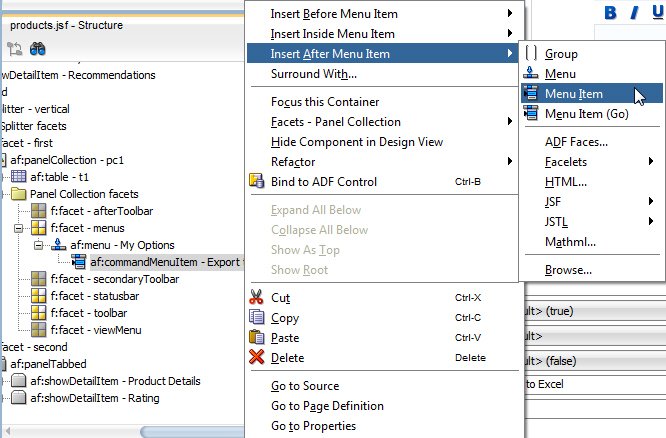
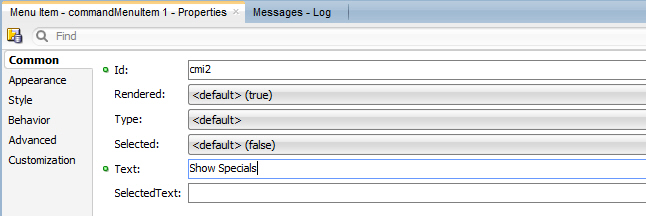
- In the Properties window set the Text property for this menu item to Show Specials.
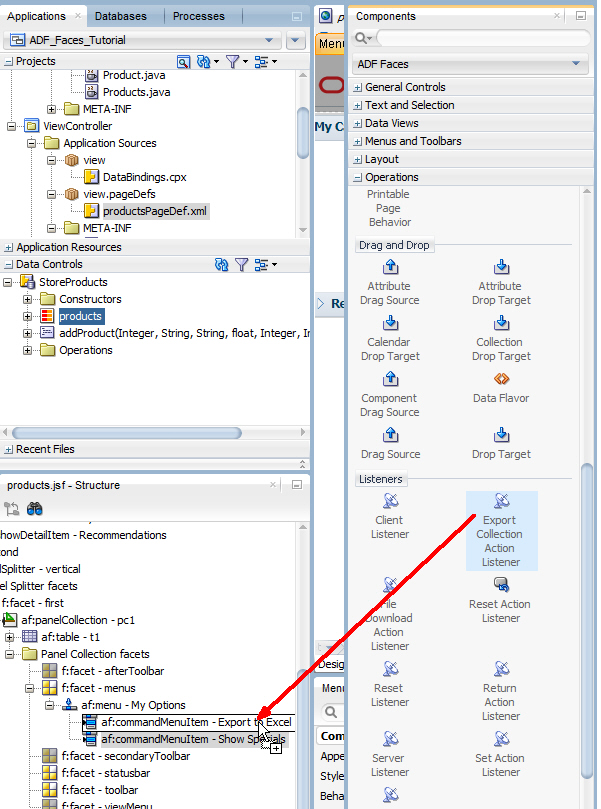
- In the Components window, expand the Operations node and find the Listeners category. Drag Export Collection Action Listener component onto the Export to Excel menu item in the Structure window.
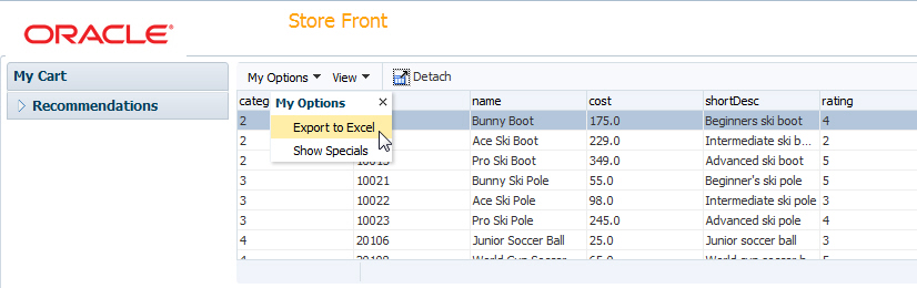
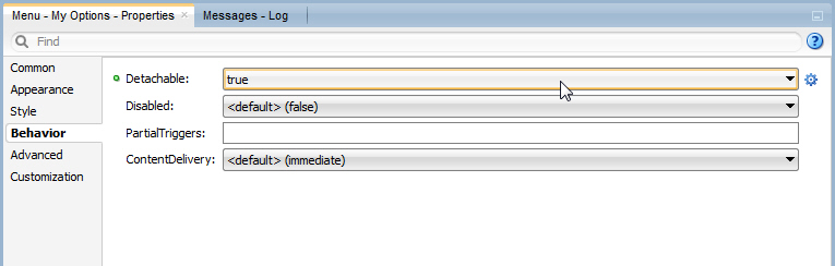
- Save all your work, return to the browser and reload the page. Click the My Options menu option and notice that you can detach the menu options from the menu bar.
- Select the Export to Excel menu option.
- Depending on your browser, a dialog may prompt you for an action to perform with the file, allowing you to open it with Excel or save it.
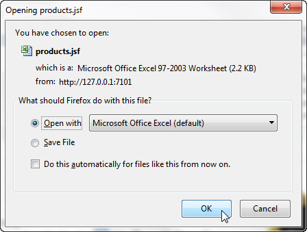 Select Open with to view the table in Excel (assuming you have Excel installed) and click OK.
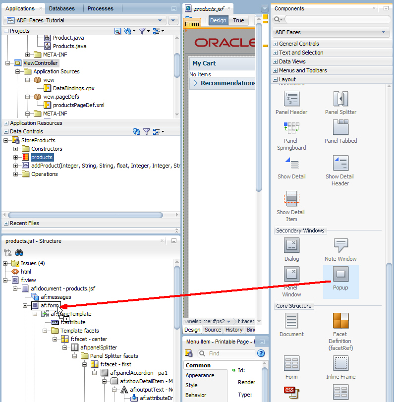
Verify the table is exported and close Excel if you wish. - Now create a popup window in the products.jsf page. In the Structure window, select the topmost af:form component.
 /
/ - In the Components window, expand the Layout category and locate the Secondary Windows section. Drag the Popup component onto the form component in the Structure window. The design view will change to allow visual editing of the popup.
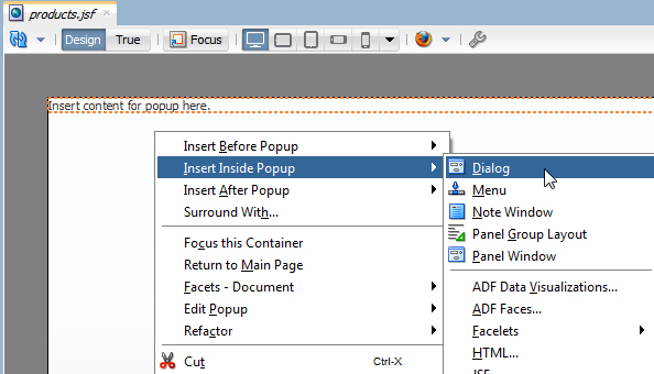
- In the Design view, right click inside the popup and select Insert inside Popup > Dialog from the context menu.
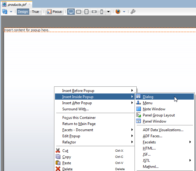
- In the Components window, expand the General Controls category and drag the Image component onto the Dialog.
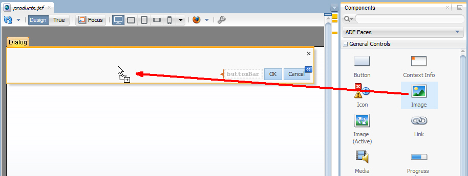
- In the Insert Image dialog, click the Property menu icon next to the source property and select Edit. Expand the images directory and select theJDeveloper.gif image as the source.
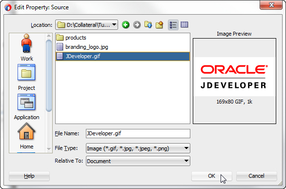
Click OK. Click Yes to relocate the gif image in the resources directory for the application, and then click Save to save it in the default location.
Click OK again. - Click in the gray area outside the dialog to return to the main page design view. In the Design view, select the My Options menu item to bring the component to focus in the Structure window.
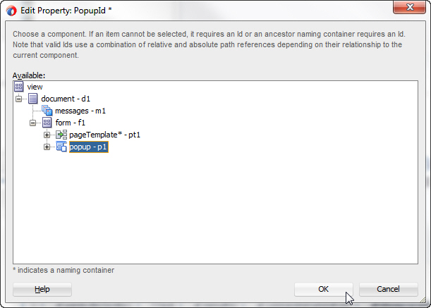
- In the Properties window, click the Property Menu icon next to the PopupId property and select Edit.
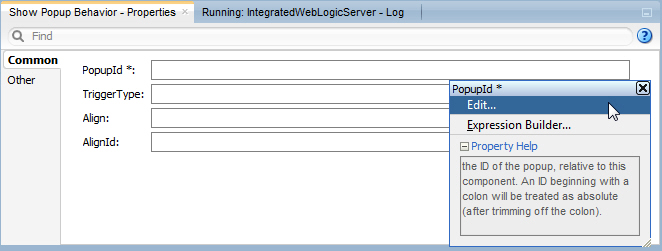
- In the Edit Property Dialog, expand the document and form nodes. Select the popup - p1 component, and click OK.
- Right click the file and choose Run to re-run the page.
Click the My Options menu and select Show Specials.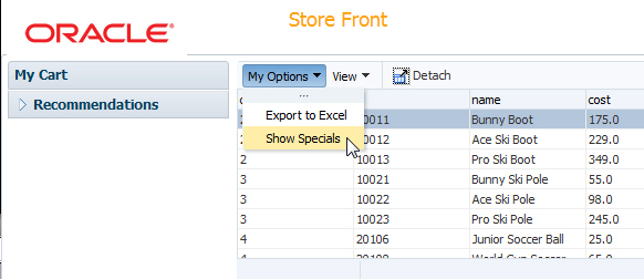 The popup dialog appears and contains the JDeveloper image.
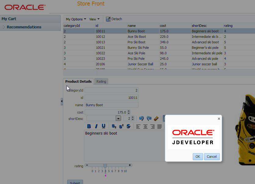
- Now provide drag and drop functionality between the Product Details tab and the My Cart accordion, allowing users to effectively fill the cart from the Product Details using a simple drag and drop operation.
In the Components window, locate the Output Text component from the ADF Faces library. Drag it onto the My Cart accordion pane.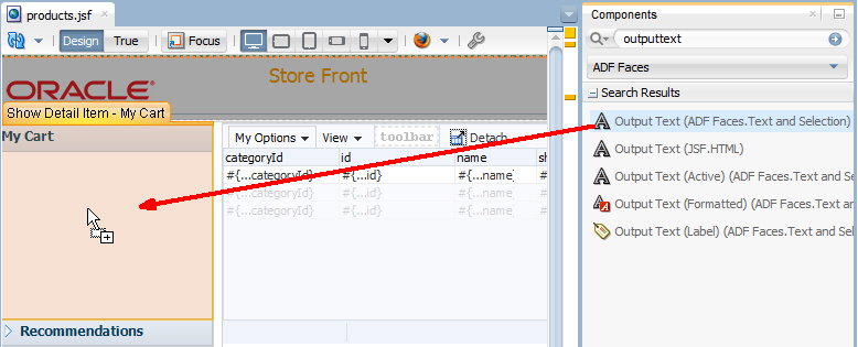 In the Properties window, set the Value property to No Items.
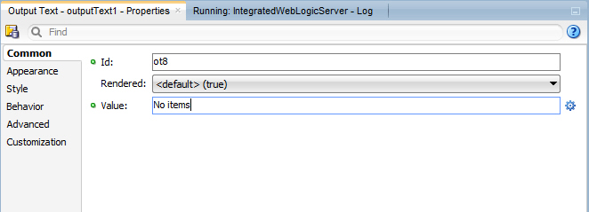
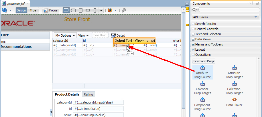
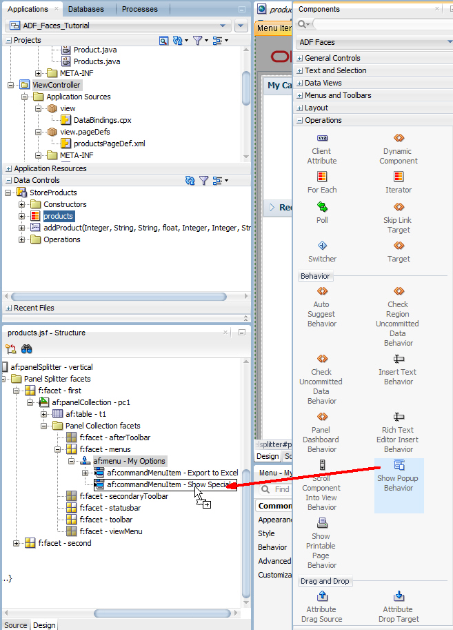
- Select the name output text component in the products table to bring it to focus in the design view. In the Components window, expand the Operations category and locate the Drag and Drop section. Select the Attribute Drag Source component and drop it onto the name output text component. Ensure that you drop the Attribute Drag Source onto the name output text, and not on the column. If you're unsure, use the Structure window.
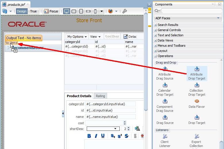
- From the Components window drag and drop an Attribute Drop Target component onto the No Items output text component.
 In the Insert Attribute Drop Target dialog, select value for the Attribute property.
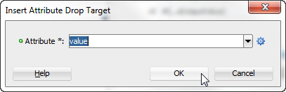
Click OK. - Save all your work and reload the page in the browser. In the products table, select a name value and drag and drop it onto the No Items text in My Cart.
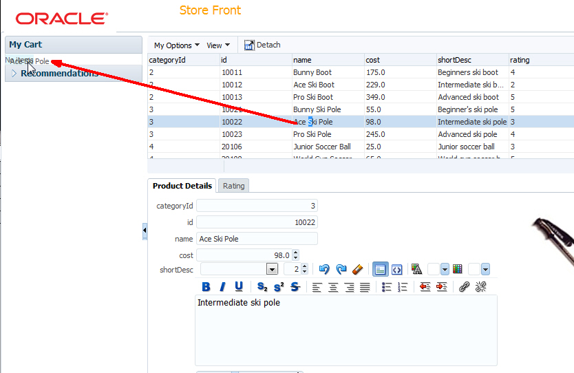
The product name is added to the cart.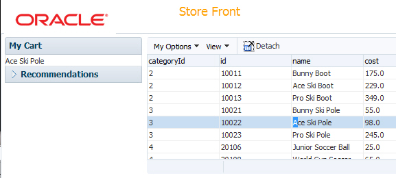
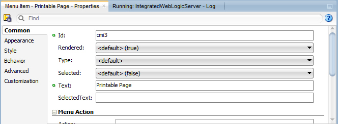
- Now add a menu option to take the current table information and display it as a printable page. In JDeveloper, add another Menu Item to the My Options menu and set the Text property to Printable Page.
- By now you should be familiar with locating components in the Components window and dragging them to the design or Structure window in order to add the component to the correct place in the page. Additionally, you should now understand that in many cases, it's best to have in focus the location where you want to add the component, by selecting a component in the design or Structure window.
Drop a Show Printable Page Behavior component onto the menu component that you just created.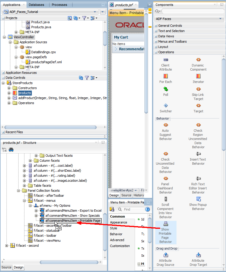
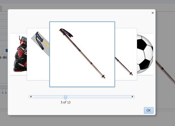
- In the next couple of steps, add a popup page to show products using a carousel.You can display images in a revolving carousel.Read more...Drag a popup component from the Components window onto the first af:form component in the Structure window.
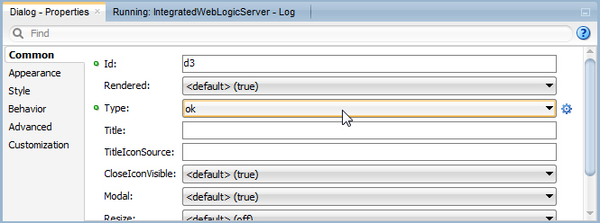
- Right click the new af:popup and select Insert Inside Popup > Dialog.
- In the Properties window, set the Type property to ok.
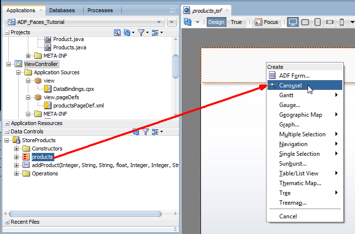
- In the Data Controls window, expand StoreProducts and drop the products collection onto the dialog in the design view. Select Carousel from the menu.
- Drag an Image component to within the carousel item component.
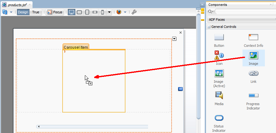
In the Insert Image dialog, enter /images/products/#{item.imageLocation} as the value for the Source property.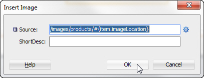
Click OK. - Click in the gray area outside the popup to return to the main design view of products.jsf.
In the Structure window, locate the viewMenu facet for the panelCollection (the panelCollection is the parent component for the products table component).
Right click the viewMenu facet and choose Insert inside f:facet - viewMenu > Menu Item.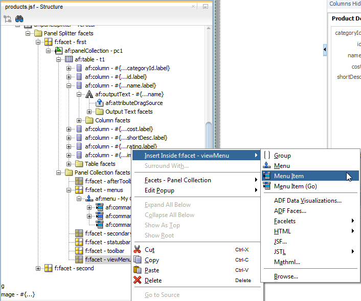
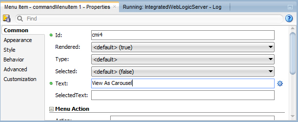
- In the Properties window, set the Text property to View As Carousel.
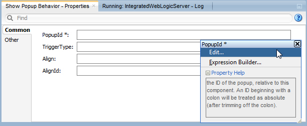
- Drop a Show Popup Behavior component onto the View As Carousel menu item.
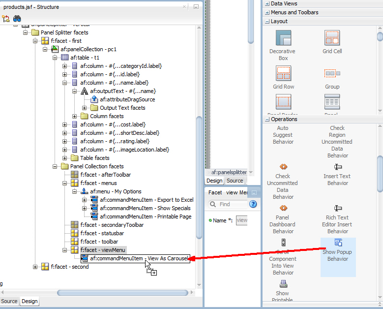
- In the Properties window, select Edit from the PopupId property menu.
- In the Edit Property dialog, expand the document and form nodes and select the popup - p2 component.
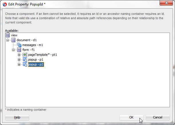
Click OK. - Save all your work and re-run the page. When it is displayed in the browser, click the My Options - Printable Page menu. The table component of the page is displayed in a separate tab in the browser and ready to be sent to a printer.
- Close the printable view and select View As Carousel from the View menu.
In the Behavior category, set the Detachable property to true.
In the Insert Export Collection dialog, type t1 (t1 is the id of the table) as the ExportedId and select excelHTML for the Type.
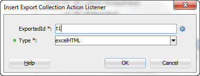
Click OK.
You can use the popup component with a number of other ADF Faces components to create a variety of dialogs, menus, and windows that provide information or request input from end users. Read more...
Read more...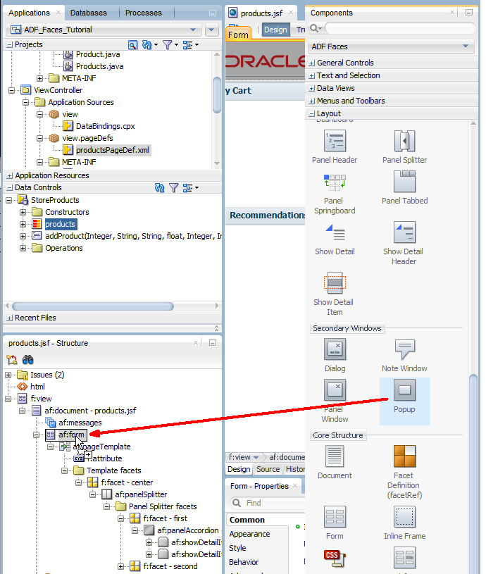
In the Components window, expand the Operations category and in the Behavior section, drag the Show Popup Behavior component onto thecommandMenuItem - Show Specials component in the Structure window.
In the Insert Attribute Drag Source dialog, select value from the drop-down list.
Click OK.
Now add a gauge to display the rating of any particular product. To create this gauge, perform the following steps:
The ADF data visualization components provide significant graphical and tabular capabilities for displaying and analyzing data. Read more...
Read more...- In the design view of the products.jsf page, click the Rating tab.
- In the data controls window, expand StoreProducts and products and drag the rating attribute onto the rating tab of the design editor. Choose Gauge... from the popup menu.
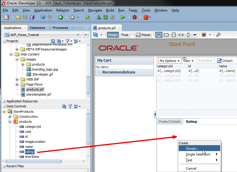
- In the Component Gallery dialog, select the Dial category, then Dial with Thresholds as the gauge type. Choose the left-most quick start layout.
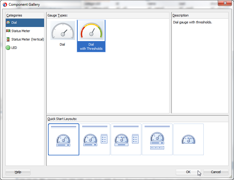
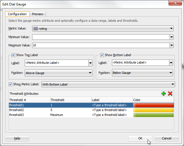
Click OK. - In the Create Dial Gauge dialog, set the Maximum Value field to 10.
Set the lowest threshold (threshold1) to 1.
Set the middle threshold (threshold2) to 5.
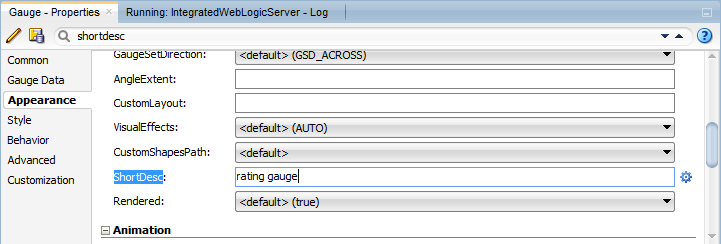
Leave the highest threshold (threshold3) at Maximum. - In the Properties window, change the ShortDesc property for the Gauge component to rating gauge.
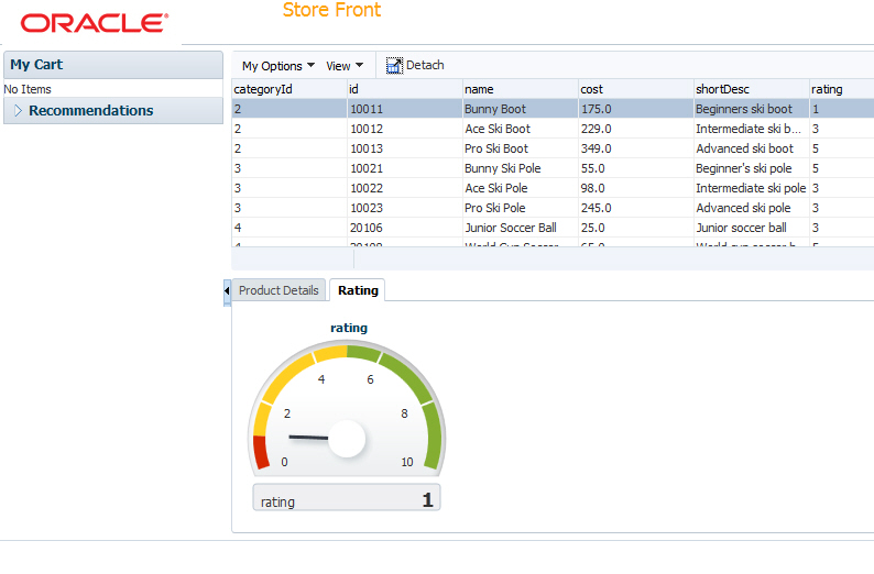
- Save your work and refresh the page in the browser. The gauge displays the current rating value for the current (first) product.
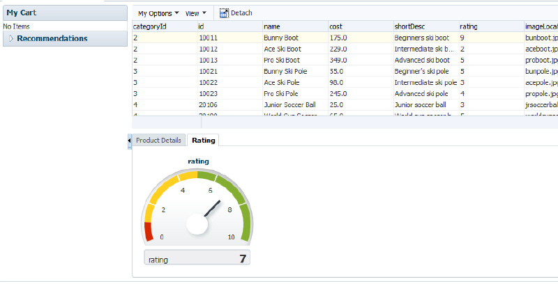
- Click the Product Details tab and move the slider to change the rating value.
- Click Submit and then click the Rating tab to see the new value reflected in the table as well as the gauge. Notice that the gauge doesn't change when a product with a different rating is selected in the table. You will correct this in the next step.
 Step 6: Implementing Partial Page RenderingIn order to refresh the gauge when the when you select a row in the table, you need to define Partial Page Rendering behavior explicitly. To do so, perform the following steps:The goal of Partial Page Rendering is to improve a web page's interactivity, speed, and usability.Read more...
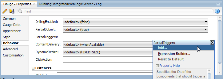
- In JDeveloper, select the rating gauge component in the design view. In the Properties window, expand the Behavior category. Click the Property menu icon for the PartialTriggers property and select Edit.
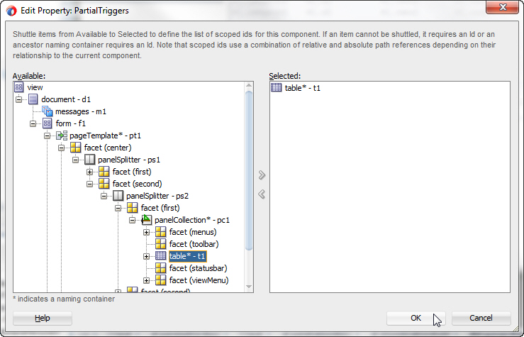
- In the Edit Property dialog, expand the document, form, pageTemplate, facet (center), panelSplitter - ps1, facet (second), panelSplitter - ps2, facet (first), and panelCollection components. Select the table* - t1 component, and shuttle it to the Selected pane. This defines what will trigger the refresh of the gauge.
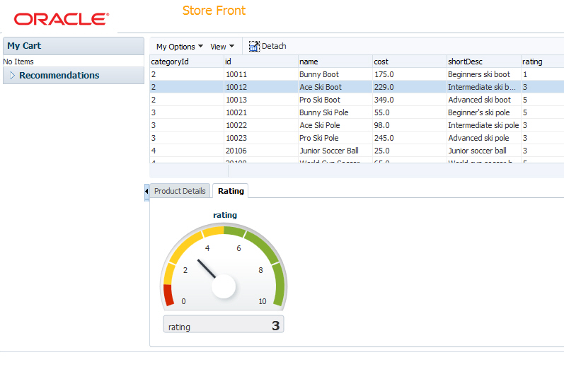
Click OK. - Save all your work and reload the page in the browser. Click the ratings tab to and select different rows in the table to refresh the gauge.
Click OK.
Step 7: Using Skins to Change the Look and Feel of an Application
Finally in this section you'll see how to change the look and feel of the whole application using a different skin. To implement this functionality, perform the following steps:
You can customize the appearance of ADF Faces and ADF Data Visualization components. Read more...
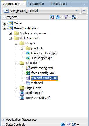
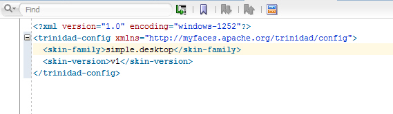
Read more...- In the Applications window, expand the Web Content - WEB-INF node and double-click the trinidad-config.xml file to open the file in the editor.
- The file defines the skin that is used in the skin-family element. Change the skin-family to simple.desktop. The simple skin is often chosen as a starting point for creating a custom skin.
- Save all your work and refresh the page in the browser. Notice the changes in the look and feel of the application.
When finished, close your browser window. You have successfully completed this tutorial.
Summary
In this tutorial you developed a page template, created a page based on the template, added data controls to the page, included DVT components, employed partial page rendering, and changed the look and feel of the page using a skin. You learned how to:- Create a Page Template
- Design a Page using the Page Template
- Use Input and Output Components
- Work with Behavior Components
- Work with ADF Data Visualization Components
- Implement Partial Page Rendering
- Use Skins to Change the Look and Feel of an Application
for more details:
https://download.oracle.com/otn_hosted_doc/jdeveloper/11gdemos/Insider_ADF12c_Overview/Insider_ADF12c_Overview.html
Comments
Post a Comment